Problem:
Main Objectives:
Researcher
Designer
User Tester
Figma
Research
We started to brainstorm, plan out, and create user personas to be our guide to understand the needs of our users.
Empathize
We took a moment to understand what challenges could be faced by our users, and how to approach them with care.
Design
With all our research in place, we developed style tiles, process flows, and wireframes to ensure accessibility needs are met.
Implement
We designed and prototyped a functional, yet intuitive app that tailored to specific interactions for our users.
Evaluate
Through user-testing, we were able to gain crucial feedback, from our peers, for the interface and prototype interactions.


Blueprint:
When we were tackling on this project, we went ahead and divided up the work in half. My classmate and I worked on creating user personas to understand the patients and their caretakers needs. Afterwards, we went ahead and designed style tiles that incorporated colors and aesthetic that established the sense of calm and tranquility.
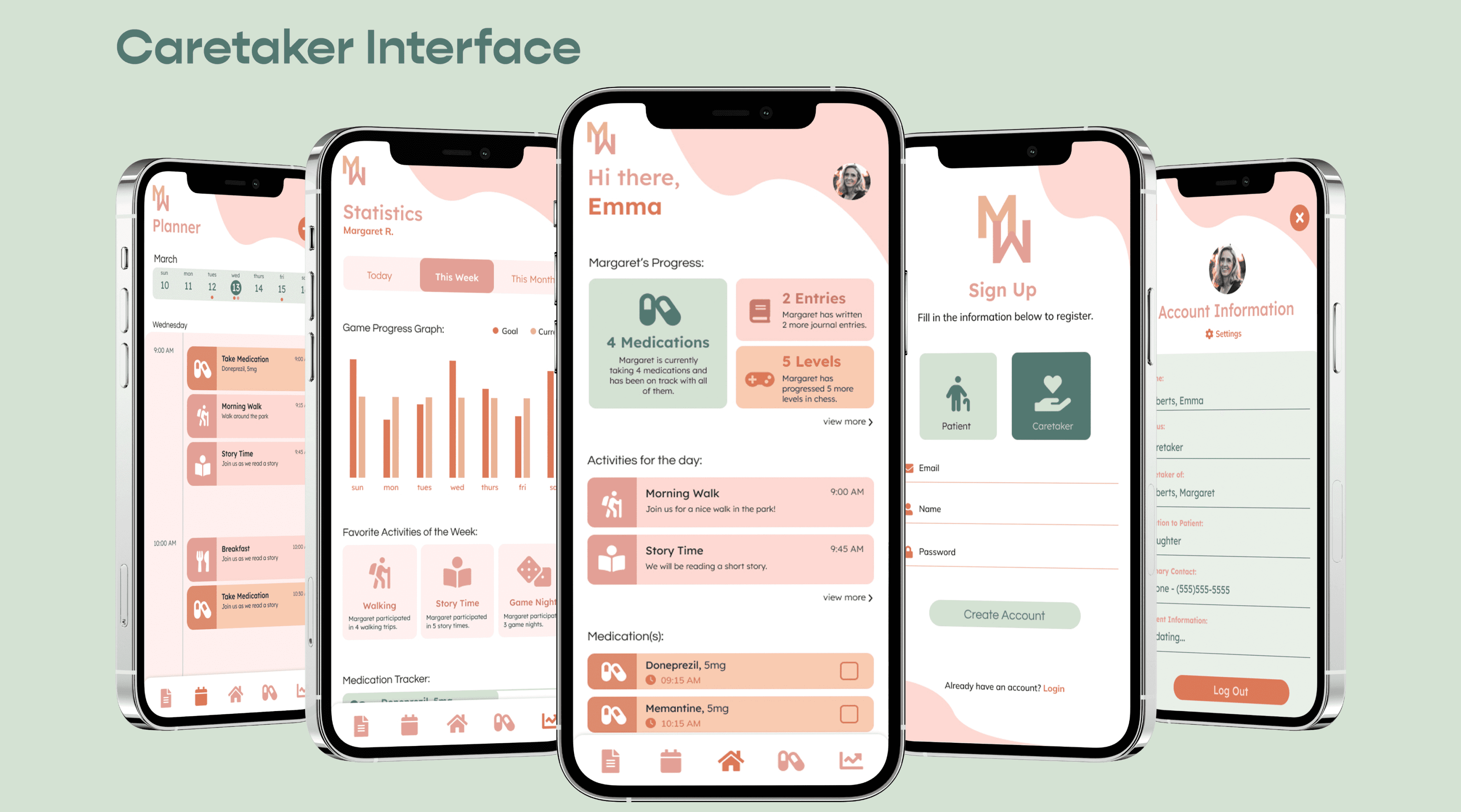
Having our visuals allowed us to moved forward with our process flows on how we need to design the app’s interfaces, and build out the prototypes for a seamless user experience. One example, is that caretakers can keep track of the daily statistical activities of their patients, a feature that is not present in the patient interface. Then, came the wireframes that gave us the direction we need to follow to start implementing our designs.
Research:
We looked into the science behind the impacts of various colors, and why select brands, advertisements, and interfaces use certain colors for their audiences. This aided us in choosing a color palette that is easy on the eyes, and followed the pattern of serenity and tranquility. Looking at the competitors existing solutions, we realized they cluttered their interfaces with information that is overwhelming for all parties involved.
As well as, tools that incorporated games and resources that help patients to gain some of their independence, during this troubling time in their life, that was lacking from some of these interfaces. Also, tools that didn’t have a place separate for caretakers to find solace for themselves.
Design:
Now, for the design of the app, we focused on greatly on the aesthetic and feel of the interface that would calm any patient that utilized the app. We chose the color Pink as our primary color due to the soothing, and peaceful feel it brings. We used various hues and tones of pink throughout the design to not make the color not burn through the screen, but keeping as much whitespace as we could.
Using colors like green, blues, and light orange complimented the pink greatly. We used rounded corners in our borders, bold icons, and minimalistic elements to not crowd the interface, and keep each screen simple. My partner even incorporated the designs seen in “lava lamps” to decorate the edges of the screens, and add on to the soothing nature of the interface.
Constraints: